vintage circus wedding, part 1


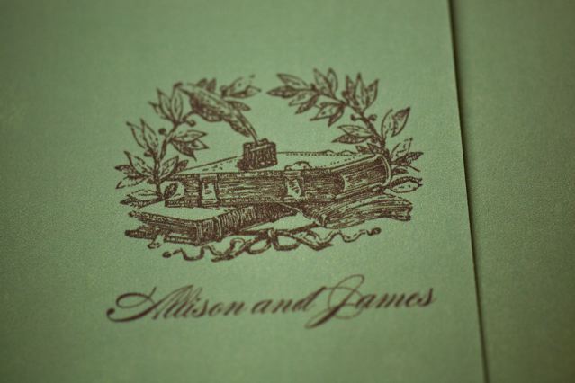
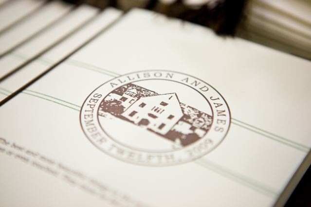
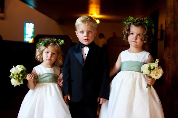
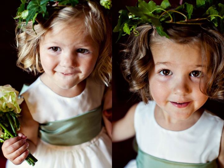
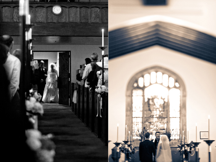
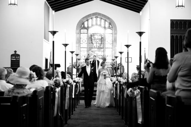
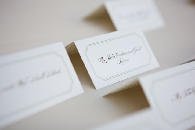
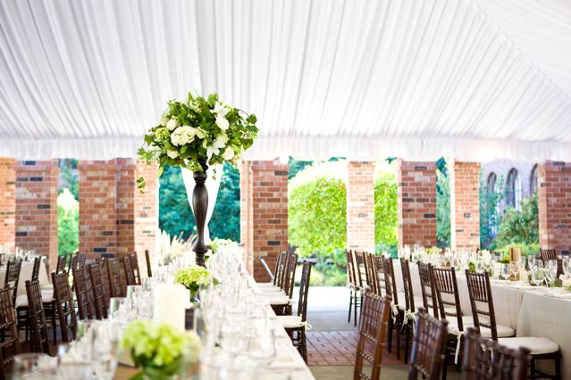
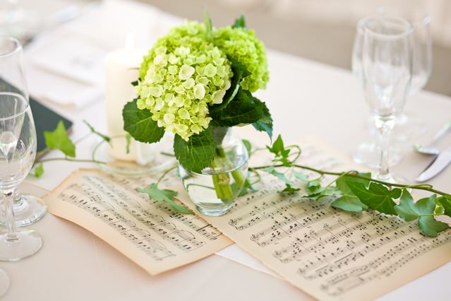
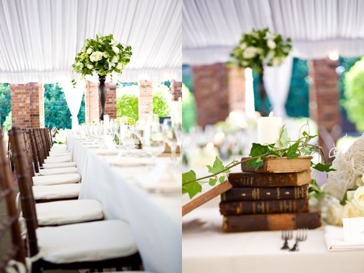
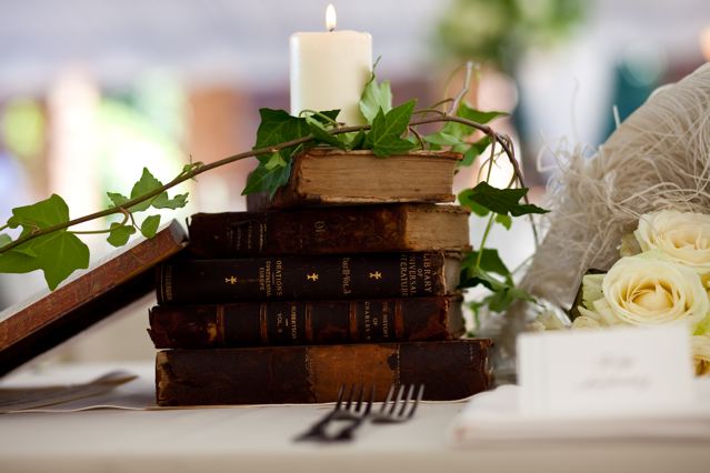
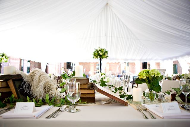
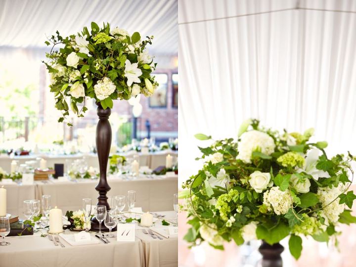
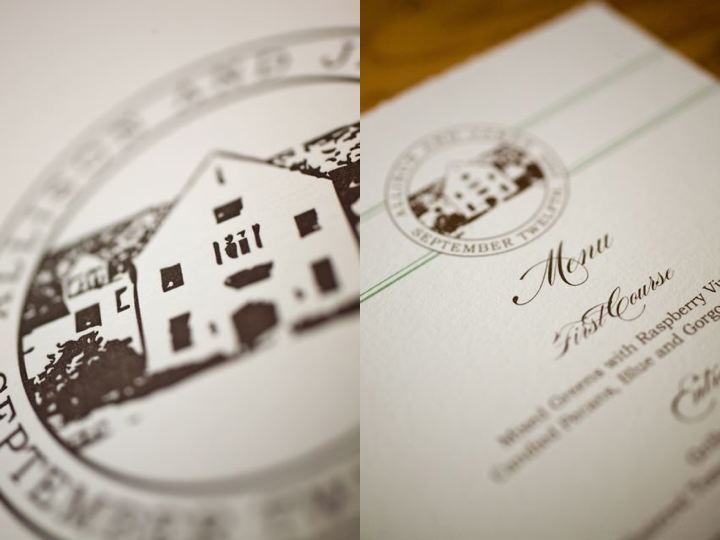
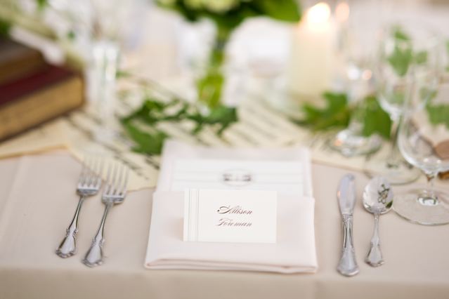
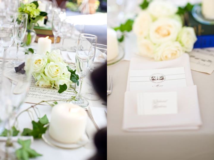
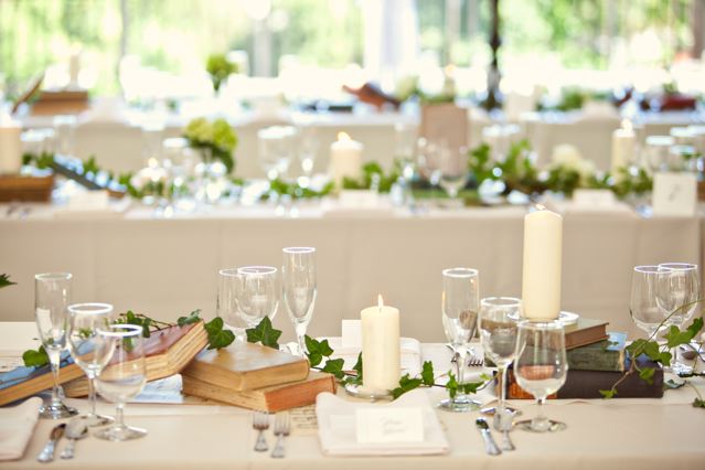
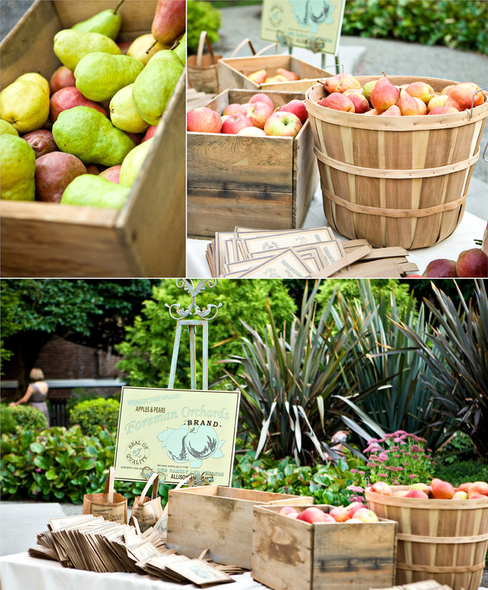
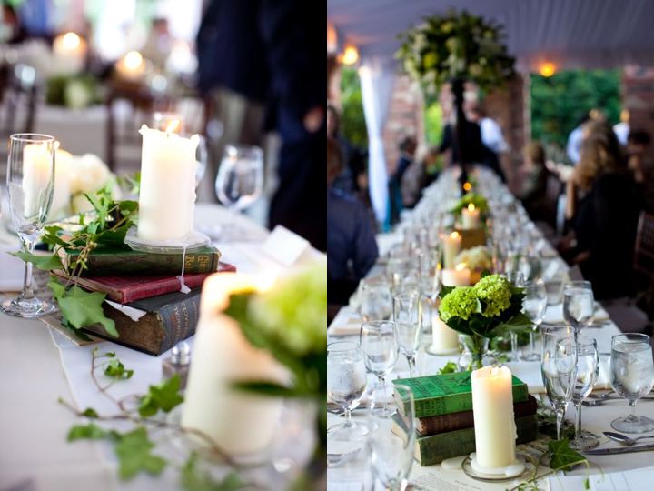
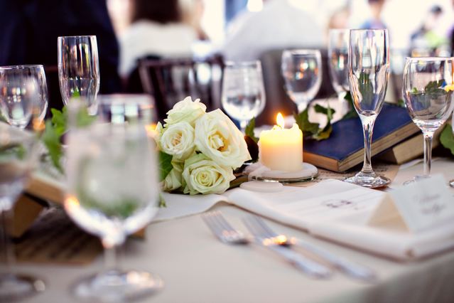
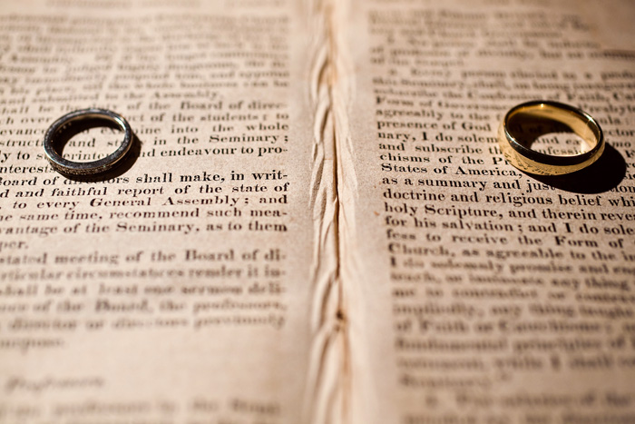
when allison and james, two recent Harvard Law School graduates, approached me about designing their wedding, they told me they wanted to showcase their passion for academia and literature while still keeping their wedding simple and approachable . . . they wanted it to be lovely but not pretentious. i had so much fun bringing their style and passion to life, and loved the structural items and textures we combined to produce this wedding. old brick walls, antique books stacked high, feather quill pens posted in ink wells, vintage sheet music, dripping candles, abundant flowers, shoots of green ivy and long rectangular banquet tables combine to create an old world library feel that was reminiscent of their studies at Harvard.
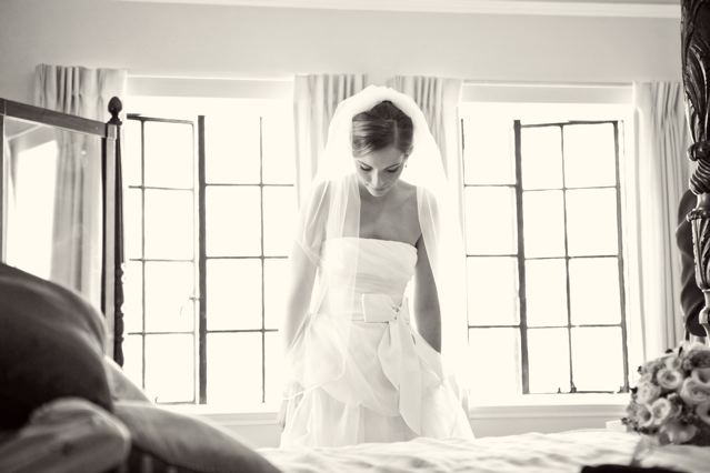
allison was such a remarkable bride; beautiful, calm collected, sweet, gracious, incredibly smart and well spoken, yet so warm hearted and focused on showing other people love. i was blessed to know her and to be part of their day.
enjoy these images from gabriel boone photography
special thanks to my good friend michelle engvall with married and more with michelle for her amazing coordination skills and bringing me on board for this wedding.
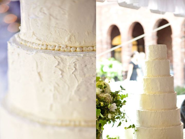
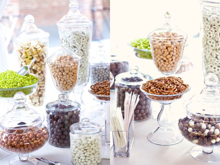
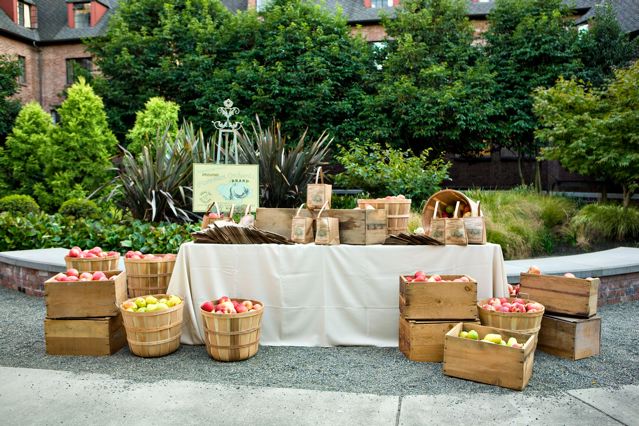
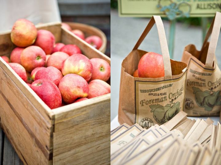
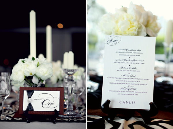
a few months back canlis, seattle's premier fine dining restaurant, called me and asked if i would be interested in partnering with them on a photo shoot to showcase the possibilities for private dining in the penthouse of their establishment.
having dined in their restaurant enjoying the chic yet welcoming environment comprised of expansive views, exceptional service, incredible food and their famous ticket-less valet, i was quite excited to partner with an establishment with a similar philosophy as mine: combining a dedication to fine details and a passion for people.
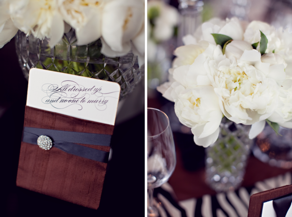
the retro-glam look of the photo shoot was inspired by the mid century architecture that defines canlis. the restaurant combines modern tones of greys, blacks and neutrals with original wood accents from 1950. i wanted to create the tablescape to feel like a natural extension of canlis, so i used black, neutrals, a touch of retro brown reminiscent of the the restaurant's original era, and then accented everything with a little bit of bling.
i custom made the linens, and played with layers of polka dots, a textured cheesecloth to add a northwest flare, zebra prints and silks and then crowned the table with crystal candlesticks, rhinestone accents and single bloom arrangements of peonies.
other details:
lynne baron lent me the unique mid-century-modern chandelier and much of the crystal, as well as her eye for detail and helping hand as we put the table together at the shoot. so great to work with her again!
dolce design constructed all of the stationery products
abc rentals provided the unique lucite chairs
luly yang designed the dress
tyler sholdt crafted all of the jewelry you will see
green light event design lit up the room with up-lighting and pin spots on the arrangements.
michele waite photographed the shoot
special thanks to Erik Holgate, my technical guy, for all his hard work in making everything happen.
if you are looking for a place to host your next private party, rehearsal dinner or small wedding reception, give give canlis a consideration. their unparallel devotion to the smallest details will make your fine dining experience or special event unlike anything you have ever experienced.




i love the gals that produce seattle metropolitan bride and groom. laura, samantha and dixie are not only talented at their jobs, but are warm hearted and just amazing people to be around. so, when they asked me to design their booth for the seattle wedding show, i was thrilled. i became even more excited when i saw the cover of the current magazine that they were going to be handing out.
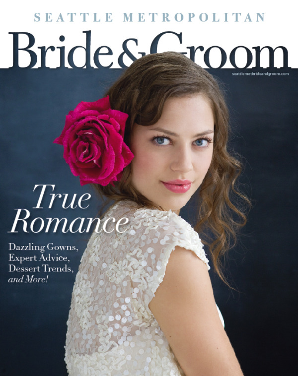
this is my favorite cover they have ever produced. the chalkboard background . . . the striking model . . . the simplicity of a bold open rose . . . this cover is ever bit as romantic as it is chic and couture. i wanted to design a booth that felt like an extension of this cover and truly represent the incredible style and inspiration that flows from every page of the magazine.
this is what we came up with:
a modern and chic feminine "library" formed with towering bookcases to hold the thousands of magazines that were given away, a custom SMD hand drawn chalkboard, soft seating with custom coordinated pillows, unique shaped arrangement of blown open roses, ornate plaster frames featuring blocks of colors, a shag rug, and a chandelier we made with hundreds of light bulbs.
i loved the different elements we used to create this booth. it was so much fun to put together.
here is a glimpse of "behind the scenes" for getting ready:
these are a few of the fabrics we used in the booth before we started cutting and sewing.
one of the most time consuming tasks for this booth was drawing the frame on the chalkboard. after studying several ornate frames, i sketched the style that i wanted to create. from there i made large patterns that were the actual size that i needed for the board. i, along with my assistant designers erik holgate and andrew clarke (pictured below) then traced those patterns onto the actual chalkboard with pencil. from there we very carefully began using the chalk . . . trickier than it looks to keep clean and not smudged. the photos will document the chalkboard journey:
i was so inspired by the large blown open rose on the cover, and knew that to keep the booth as clean and simple as the style on the cover, i had to use the same kind of flowers for the booth. this was also staying consistent with the "single bloom arrangement" spread that was featured in the magazine as well.
seattle metropolitan represents all things unique and new, so to get away with using all roses, a common ordinary flower, i needed to create interesting shaped arrangements. i thought a triangle would be a nice change from the traditional round shape of arrangements. this is how they turned out:
this is erik spending hours carefully crafting the light bulb chandelier. i am so thankful for people who have more patience than i, to do incredibly tedious jobs.
and here are a few more pictures of the finished booth:
we had such a great time putting it together and had really great feedback from people at the show. thanks seattle met for the opportunity to collaborate with you once again!
having trustworthy, reliable employees that you don't have to micro manage and can completely trust is the key to any successful business. that's why as a business owner i feel very fortunate to have the privilege of working alongside rachel louws, a wonderful colleague and friend.
rachel runs the coordination division of my business. she lines up vendors, analyzes contracts, divides budgets, creates time lines and schedules, organizes the wedding rehearsal, choreographs the wedding ceremony, keeps the wedding day running smooth, alleviates worry and stress from the planning and wedding itself allowing my clients to show up to their own wedding as guests so they can simply enjoy the day. She plans the wedding so the bride and groom can plan their marriage.
additionally, she keeps me sane and really allows me to focus on the things i love and am passionate about, which are the design elements of our events. furthermore, she brings me incredible baked goods (i'm a sucker for fresh baked treats). i am so blessed to have her on my team and feel privileged to work alongside her.
this fall she was a bridesmaid in a wedding. every bridesmaid was given a few yards of fabric and could pick the style of dress they wanted to have created for them. although i typically do not construct bridesmaid dresses, i had the honor of creating rachel's dress for her. this is what we came up with:
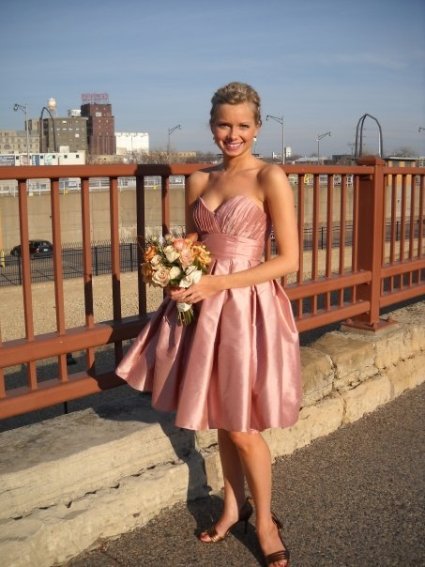
this dress, created from raw silk, included a sweetheart bodice with hand pleated ruching, a smooth high waisted panel and a full crinoline-supported skirt hand formed with box pleats. i even added pockets to keep her hands warm and to store a few extra things.
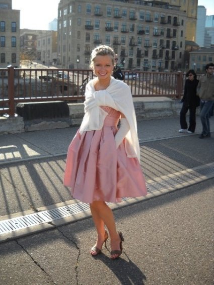
i might be biased since i created this dress, but i think she looks absolutely amazing. and, note the perfect fit. but, like i said, i might be biased . . .
rachel, you are great, and certainly an asset to the team. thanks for all you do . . . freeing me to focus on my passion, encouraging me, keeping me sane, taking great care of our clients and baking great treats! i enjoyed creating this dress for you, and i was so thrilled you loved it. you renewed my passion for designing and constructing couture gowns. you looked stunning.
 bridesmaids,
  couture gowns in
  bridesmaids,
  couture gowns