Entries in wedding design (5)

Monday
Dec282009

lindsay and jp inspiration to reality, part 1

every wedding that i design begins with some sort of inspiration. sometimes it is a texture, an image, or a color, while other times inspiration might come from a specific mood, magazine clipping or even something random from someone's house.

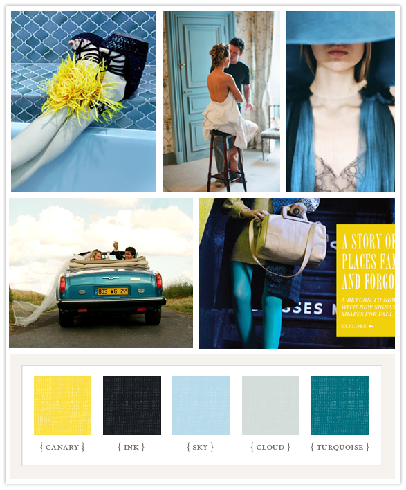
this inspiration board below is what i used to design a wedding for lindsay and jp.

lindsey and jp wanted a fun wedding that was bright and cheerful and had the ambience of a relaxed, care free evening. they also wanted it to be thoughtfully put together, being very intentional about every detail.

this story board was the perfect answer as we looked for inspiration. the colors were happy and bright yet still distinctive and unique for a wedding.  we loved the pattern and coloring of the blue tile contrasted with the spiky yellow flower, the fun mood set with the couple having a great time in the car, and even the tone set by the image of the girl in the turquoise tights.  i was especially drawn to the bold yellow block of color that served as a background to the words in that image.

the next couple of blog entries will show how we took the inspiration set by these images and the playful tone that was conveyed and turned  it into reality for the actual wedding.

Monday
Dec072009

jenny and mac

along with her mother, jenny and i worked for about 14 months planning and designing this wedding. we combined jenny's eclectic style and  love for handmade objects and funky details with her mother's flair for elegance, romance and beauty.  because combining styles can sometimes be a tricky process, i was thrilled when both women loved how the wedding turned out. seeing both mother and daughter beaming throughout the entire evening was the perfect way to end the year of planning. it really was such a perfect day.

i hope you enjoy these details, photographed by michele. 
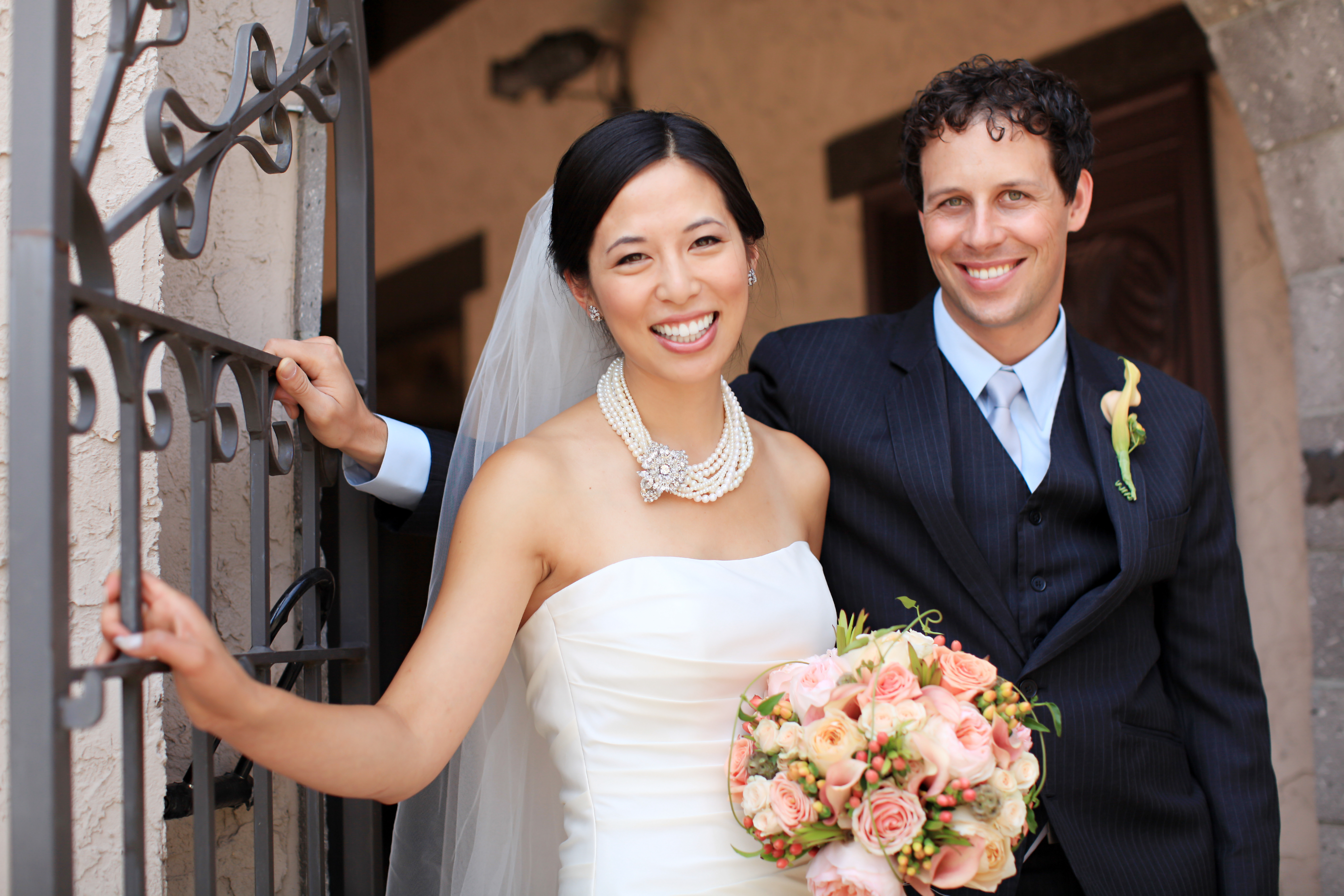


bouquets were formed from south american garden roses, locally grown garden roses, traditional roses, hypericum berries, scabiosa pods, lucadendron and clematis vines. 

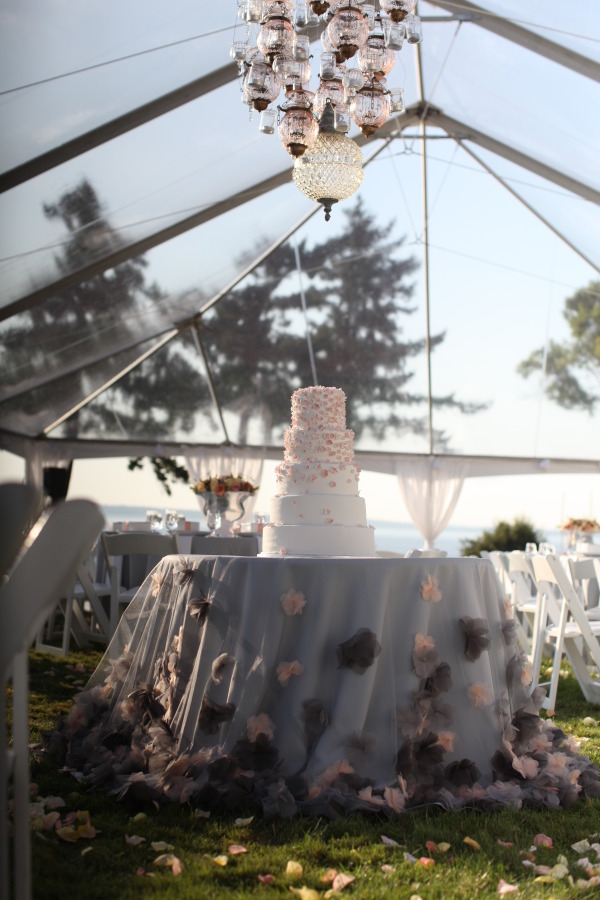
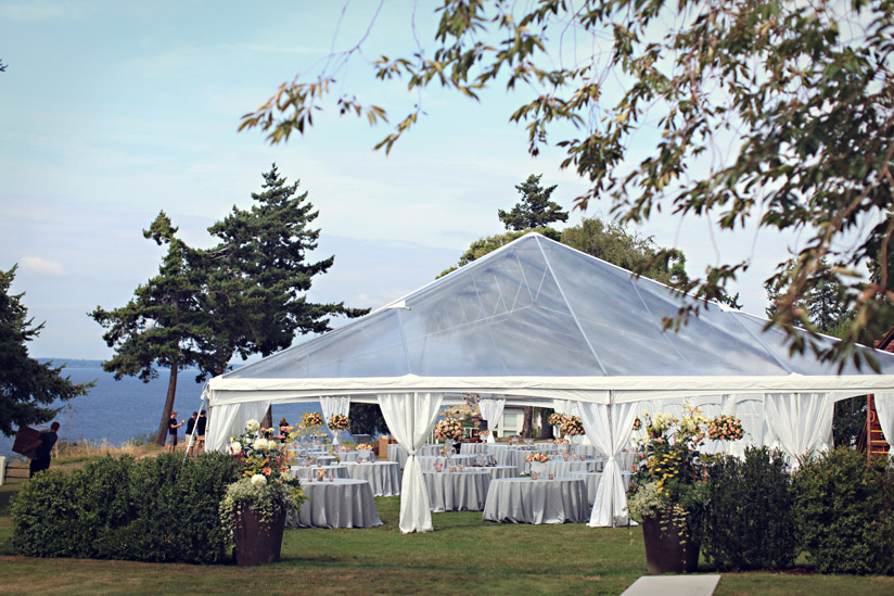
as not to obstruct the amazing view of the san juan islands, we used a non traditional clear span tent for the reception. grey linens were draped over each table to form a solid foundation to build the color palette on top of. 
 

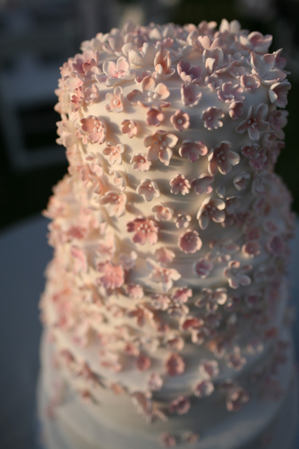
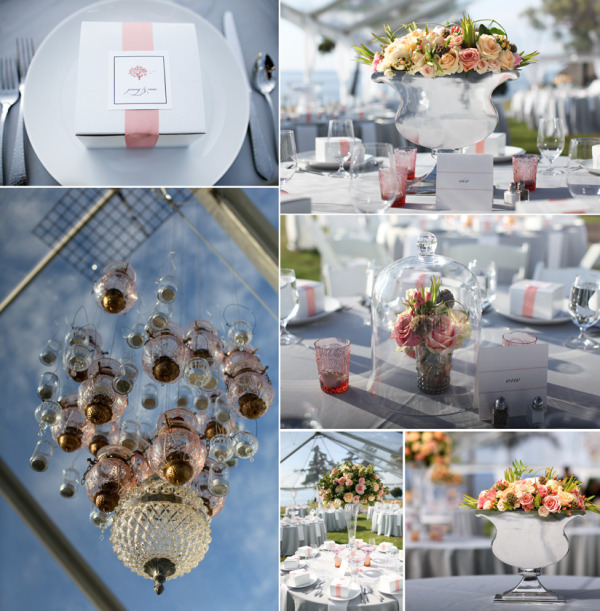
to add interest, we created a variety of centerpieces in different kinds of urns and vases.  we collected pink, peach and grey glass votive holders and vases for this wedding as well. the reception flowers echoed the brides bouquet. once again, dolce design created all of the stationery items. the lantern chandelier was created from anthropologie lanterns. we custom made the cake table cloth with grey tulle and grey and peach handmade flowers. although we made all of the gum paste flowers, the cake itself was created by the talented haggen artist, karen.
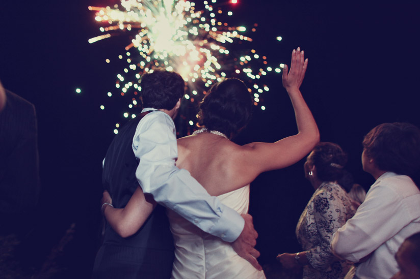
my crew of young guys that work with me wanted to surprise jenny, so late in the evening they snuck down the side of the cliff and created a fire works display. the bride and her guests all loved watching the sky light up.  (nice job erik, tyson and andrew!) 
jenny and mac-  jenny, I have never changed color palettes with a client as many times as we did, but I have also never laughed as much as i did with you.  thank you for making planning your wedding so much fun. . . we really could write a book about all of our experiences!  thank you also for being such a bright, playful, kind-kindhearted woman who brings joy into every situation and genuinely loves people. mac, you are  a gentle, calm, unwavering and solid support for jenny. the two of you are so good together, and your interaction with each other shows that your marriage will be one filled with much laughter, friendship, love and stead fast devotion. thank you for letting me be part of your lives over the past year. your wedding is one i will always remember fondly.
 

Wednesday
Dec022009

first glimpse

blogging is addicting. it is also incredibly time consuming.  i have to laugh at myself now for my impatience as i so often eagerly await other bloggers new entries, wondering "why in the world is it taking so long to throw up a few pictures!?" 

so, although i would love to sit here and keep posting more of my recent weddings, my hands are quite full this week in the studio preparing for my next wedding.  i have favor boxes to tie, arrangements to prep, vases and lanterns to pack, fabric to iron, a wedding dress to pick up and more shopping to do. tomorrow i have peonies arriving from holland, garden roses from south america, orchids from hawaii, gardenias from california  and magnolia leaves from south carolina.

even though i have to set the blog addiction aside and continue the preparations for the wedding this weekend, i wanted to leave you with the first glimpse of the next wedding i will be posting.  

i love this image michele  captured that displays our work. the lantern chandelier, which took over eight hours to create, hung above a cake that was adorned with hundreds of sugar paste flowers i formed and painted just days before the wedding. the cake was set on top of a custom couture linen that was fashioned from countless amounts of hand made fabric flowers.

it was an incredible wedding with countless details i am eager to share. here is your first glimpse to enjoy.

Monday
Nov302009

classic goth makeover, part 1

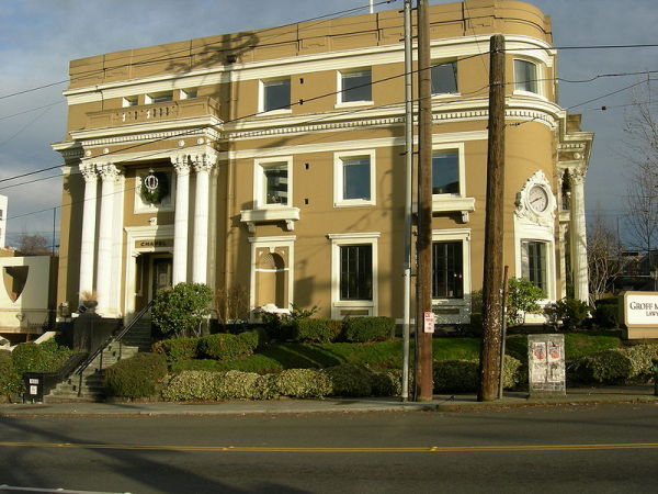
although i love producing events that give me a challenge, i wasn't quite sure what to think when ben and china picked the chapel bar as the venue for their wedding. don't get me wrong, chapel bar itself is an amazing building.  the tall ceilings, dark ambience, old world interior created the perfect ambience for the 19th century classic goth look my clients were dreaming about.  they wanted a space that was untraditional, a little funky and would surprise people when they received their invitation.  chapel bar, sitting majestically on seattle's capitol hill with her grand pillars and a dramatic staircase entrance,  met all of their criteria, so it seemed like the best option for the wedding.

however, there were some obstacles to overcome. the bar itself could not appropriately hold the number of guests that were invited for a sit down ceremony and reception.  if we were to use this venue, we were going to have to use the outside veranda to hold these portions of the wedding. the building that houses the chapel bar, had once been a funeral home.  the veranda was where the hearse used to park to receive the coffins.

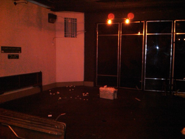
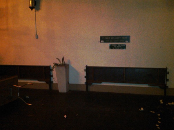
the challenge: turning the veranda which was basically a  dark covered garage into an elegant space to host both the ceremony and reception.

these pictures below (poorly photographed with my blackberry) will give you a deep appreciation for my next posting which will show the makeover, as we turned chapel bar's portico into the classic goth wedding my clients dreamed about.


Wednesday
Nov252009

autumn inspiration

autumn is my favorite season of the year. it is the season of abundance, boasting deep colors, fibrous textures and a bountiful harvest. 

needless to say, when tina and reed chose an autumn date for their wedding i was thrilled.  the bride and groom wanted their intimate wedding, hosting 25 people, to be part classic, part elegant, a little bit rustic and excessively rich in detail.  combining the splendor of the season with raw northwest textures, locally harvested flowers and vegetables and luxuriously chic fabrics created the perfect ambience for this couture autumn wedding.

this posting will showcase a bit of the design process featuring the color palette and some  of my water-colored sketches i used to propose my ideas to my client. the next entry will have the images from the actual wedding itself.


the color palette


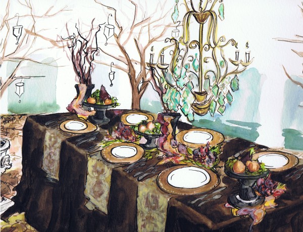
rendering of the reception table proposal . . . floor covered with abundant leaves, vintage chandelier, candle lit twig trees, custom velvet table cloth and gold napkins, pedestals of fruit and vegetables, fabrics, chargers, urns and candles. 


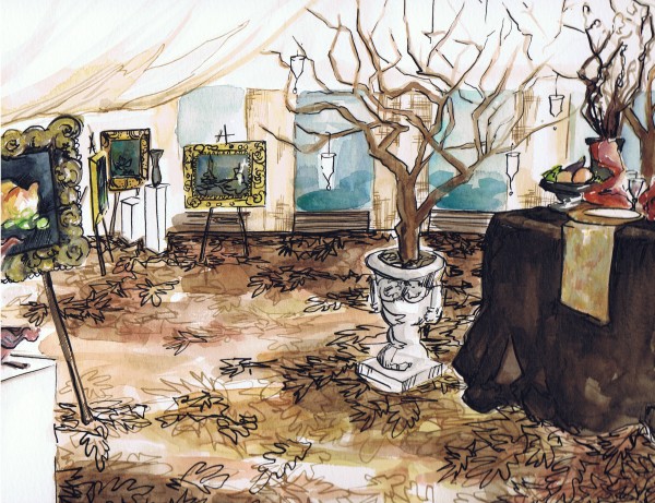
rendering of the reception art gallery